jennakafor00@gmail.com
Jen.
Build a Responsive Text Component with Design Tokens
Build a Text component from design tokens. We'll convert Figma Variables into CSS variables to style a React component.
02, Dec, 2025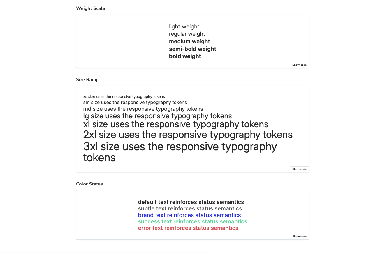
Building a component seems straightforward until you realize how much coordination it requires between design and code. Designers define font sizes, weights, colors, and responsive behavior in Figma. Developers then rebuild that logic manually in components. The structure that exists in design tokens doesn’t always make it to code.
This article walks you through building a Text component that actually uses the token structure created in design. We'll set up a pipeline that converts Figma variables into CSS, then build a component that references those tokens. By the end, you'll have a reusable primitive that stays in sync with your design system.
Would you prefer video format? Watch it here!
For this workflow, you’ll need:
- Style Dictionary
- Storybook
- A code editor (I'm using VSCode)
- Some HTML/JSX, CSS, and TypeScript knowledge
- Some React knowledge
Optional (needed if you want to explore the Figma workflow):
Want the full code? Clone the GitHub repo.
Designing the text component
Before we jump into code, I want to walk you through the structure of the design tokens. Understanding this will make the implementation much clearer.
The tokens follow a three-layer architecture that flows from options to components:
Options layer
This is the foundation; all the raw values available in the design system. It includes:
- Scale values: 0, 1px, 2px, 4px, 8px, and so on.
- Color palette: All color values and shades that could be used.
These are just reference values with no semantic meaning yet. They establish what's available to choose from.


Semantics layer
The semantics layer assigns meaning to those raw options. It's divided into two:
- Semantic base (s-base)
Holds tokens that only need one mode. These are values that don't change based on context, like font weights and colors. Each font weight variable - light, regular, medium, semi-bold, bold - only has one mode. Same with colors, since we're not doing themes in this example.

- Semantic responsive (s-responsive)
Contains tokens that need multiple modes for responsiveness, specifically font sizes and line heights. Since we're building responsiveness into the design tokens, this layer contains mobile and desktop modes for each token. So we have xs, sm, md, lg, xl, 2xl, and 3xl. Each one has a value for mobile and a value for desktop.

Component tokens
This is where our Text component lives. The component tokens reference the semantic values. For font size and line height, we're only referencing the s-responsive tokens, which already contain both mobile and desktop values. The responsiveness is baked into the token itself, so we don't need to write media queries in our component code.
This layered approach keeps everything organized and makes changes easier. If you need to adjust a font size, you update it once in the semantic layer, and it flows through to every component that uses it.

Tokens pipeline
My tokens start as Figma Variables, organized into the collections I described above. I installed the Tokens Studio plugin and imported those variables into it. From there, I can export them as JSON.
You can copy my tokens as JSON from this GitHub link.
Code implementation
Create project
- If you’re starting with a new project, create a folder in your directory. I’m naming mine
text-component-with-design-tokens. - Open the folder in your code editor, and then open the terminal. Run
npm create vite@latest . -- --template react-ts - Accept the default configs by clicking ‘Enter’ on each one, until your project is created successfully.
- Once the dev server starts, go to the local URL to confirm that everything works as expected. This is usually http://localhost:5173/, unless you already have something else running there.
Convert tokens
- We need to convert our tokens into CSS variables. To achieve this, we’ll create a script that uses style dictionary and Tokens Studio’s SD transforms.
- In your terminal, run
npm install style-dictionary @tokens-studio/sd-transforms. - At the root of your project, create a
tokens.jsonfile and paste in the content of the JSON file link shared above. - Create another file called
buildTokens.tsand paste in the functions below.
import StyleDictionary from "style-dictionary";import type { Dictionary, TransformedToken } from "style-dictionary";import { register, getTransforms } from "@tokens-studio/sd-transforms";import fs from "fs";import { fileURLToPath } from "url";type TokenValue = {value: string;type: string;[key: string]: unknown;};type TokenObject = {[key: string]: TokenValue | TokenObject;};type TokensFile = TokenObject & {$metadata?: {tokenSetOrder?: string[];};$themes?: unknown;};type TextTokenMap = Map<string, TransformedToken>;const MOBILE_SET_NAME = "s-responsive/Mobile";const DESKTOP_SET_NAME = "s-responsive/Desktop";const OUTPUT_PATH = fileURLToPath(new URL("src/tokens.css", import.meta.url));const tokensPath = fileURLToPath(new URL("tokens.json", import.meta.url));const tokens: TokensFile = JSON.parse(fs.readFileSync(tokensPath, "utf8"));// fixes fontWeight tokens that were exported with the type of "text" due to Figma's setupfunction fixFontWeightTypes(obj: TokenObject | TokenValue,isInFontWeight = false): void {if (typeof obj !== "object" || obj === null) {return;}if (isInFontWeight && "type" in obj && obj.type === "text") {obj.type = "fontWeight";}for (const key in obj) {if (typeof obj[key] === "object" && obj[key] !== null) {const newIsInFontWeight = key === "fontWeight" || isInFontWeight;fixFontWeightTypes(obj[key] as TokenObject | TokenValue,newIsInFontWeight);}}}// checks if a value is a leaf token entryfunction isTokenValue(value: TokenValue | TokenObject | undefined): value is TokenValue {return Boolean(value && typeof value === "object" && "value" in value);}// recursively merges two token objects without losing leaf nodesfunction deepMerge(target: TokenObject,source: TokenObject | undefined): TokenObject {if (!source) {return target;}const result: TokenObject = { ...target };for (const key of Object.keys(source)) {const sourceValue = source[key];const targetValue = result[key];if (typeof sourceValue === "object" &&sourceValue !== null &&typeof targetValue === "object" &&targetValue !== null &&!isTokenValue(sourceValue) &&!isTokenValue(targetValue)) {result[key] = deepMerge(targetValue as TokenObject,sourceValue as TokenObject);} else {result[key] = sourceValue;}}return result;}// reads the token set order from metadatafunction getTokenSetOrder(): string[] {const order = tokens.$metadata?.tokenSetOrder;if (!Array.isArray(order) || order.length === 0) {throw new Error("Token set order metadata is missing.");}return order;}// returns each set name up to and including the target setfunction getSetNamesUpTo(targetSet: string, order: string[]): string[] {const targetIndex = order.indexOf(targetSet);if (targetIndex === -1) {throw new Error(`Missing token set "${targetSet}" in tokenSetOrder.`);}return order.slice(0, targetIndex + 1);}// merges multiple token sets into a single objectfunction mergeTokenSets(setNames: string[]): TokenObject {return setNames.reduce<TokenObject>((acc, setName) => {const currentSet = tokens[setName];if (!currentSet || typeof currentSet !== "object") {throw new Error(`Token set "${setName}" is not defined.`);}return deepMerge(acc, currentSet as TokenObject);}, {});}// builds a Style Dictionary dictionary from a list of set namesasync function createDictionaryForSets(setNames: string[],transforms: string[]): Promise<Dictionary> {const mergedTokens = mergeTokenSets(setNames);const sd = new StyleDictionary({tokens: mergedTokens,platforms: {base: {transforms,},},});await sd.init();return sd.getPlatformTokens("base");}// converts camel or spaced strings into kebab-casefunction toKebabCase(value: string): string {return value.replace(/([a-z0-9])([A-Z])/g, "$1-$2").replace(/s+/g, "-").toLowerCase();}// converts a token to its css custom property namefunction getCssVarName(token: TransformedToken): string {const segments = token.path.slice(1).map(toKebabCase);return `--text-${segments.join("-")}`;}// builds a map of text token keys to their valuesfunction extractTextTokenMap(tokens: TransformedToken[]): TextTokenMap {return tokens.reduce<TextTokenMap>((map, token) => {if (!Array.isArray(token.path) || token.path[0] !== "text") {return map;}const key = token.path.slice(1).join(".");map.set(key, token);return map;}, new Map());}// generates css variable output with mobile defaults and desktop overridesfunction buildCssOutput(mobileTokens: TransformedToken[],desktopTokens: TransformedToken[]): string {const mobileMap = extractTextTokenMap(mobileTokens);const desktopMap = extractTextTokenMap(desktopTokens);const sortedKeys = Array.from(mobileMap.keys()).sort();const rootLines = sortedKeys.map((key) => {const token = mobileMap.get(key);if (!token) {return null;}return ` ${getCssVarName(token)}: ${token.value};`;});const desktopOverrideKeys = sortedKeys.filter((key) => key.startsWith("fontSize.") || key.startsWith("lineHeight."));const desktopLines = desktopOverrideKeys.map((key) => {const token = desktopMap.get(key);if (!token) {return null;}return ` ${getCssVarName(token)}: ${token.value};`;}).filter((line): line is string => Boolean(line));const lines = ["/**"," * Do not edit directly, this file was auto-generated."," */","",":root {",...rootLines.filter((line): line is string => Boolean(line)),"}",];if (desktopLines.length > 0) {lines.push("","@media only screen and (min-width: 1025px) {"," :root {",...desktopLines," }","}");}lines.push("");return lines.join("");}fixFontWeightTypes(tokens);// orchestrates generation of css variables from the responsive token setsasync function buildTokens(): Promise<void> {await register(StyleDictionary);const tokensStudioTransforms = getTransforms();const transforms = ["name/kebab", ...tokensStudioTransforms];const tokenSetOrder = getTokenSetOrder();const mobileSets = getSetNamesUpTo(MOBILE_SET_NAME, tokenSetOrder);const desktopSets = getSetNamesUpTo(DESKTOP_SET_NAME, tokenSetOrder);const [mobileDictionary, desktopDictionary] = await Promise.all([createDictionaryForSets(mobileSets, transforms),createDictionaryForSets(desktopSets, transforms),]);const cssOutput = buildCssOutput(mobileDictionary.allTokens,desktopDictionary.allTokens);fs.writeFileSync(OUTPUT_PATH, cssOutput);}buildTokens().catch((error) => {console.error(error);process.exit(1);});
- Run
npx tsx buildTokens.tsand you should have atokens.cssfile insrc/containing all the tokens as CSS variables. Responsiveness has been handled automatically, with the mobile variables defined first, then the desktop variables defined in a media query override. - Note: both your development and design teams must agree on these breakpoints to keep your UIs matched. Breakpoints can also be defined as design tokens.
- If you want these variables in a different folder, change the buildPath in the
buildTokensfunction. - If you skipped the tokens transformation, you can copy the variables below.
/*** Do not edit directly, this file was auto-generated.*/:root {--text-color-brand: #2828df;--text-color-default: #2d2d2d;--text-color-error: #df5b5b;--text-color-subtle: #5c5c5c;--text-color-success: #5bd79e;--text-font-family-inter: Inter;--text-font-size-2xl: 32px;--text-font-size-3xl: 36px;--text-font-size-lg: 24px;--text-font-size-md: 20px;--text-font-size-sm: 16px;--text-font-size-xl: 28px;--text-font-size-xs: 12px;--text-font-weight-bold: 700;--text-font-weight-light: 300;--text-font-weight-medium: 500;--text-font-weight-regular: 400;--text-font-weight-semi-bold: 600;--text-line-height-2xl: 40px;--text-line-height-3xl: 44px;--text-line-height-lg: 20px;--text-line-height-md: 20px;--text-line-height-sm: 16px;--text-line-height-xl: 24px;--text-line-height-xs: 16px;}@media only screen and (min-width: 1025px) {:root {--text-font-size-2xl: 44px;--text-font-size-3xl: 48px;--text-font-size-lg: 32px;--text-font-size-md: 24px;--text-font-size-sm: 20px;--text-font-size-xl: 40px;--text-font-size-xs: 16px;--text-line-height-2xl: 40px;--text-line-height-3xl: 48px;--text-line-height-lg: 24px;--text-line-height-md: 20px;--text-line-height-sm: 16px;--text-line-height-xl: 32px;--text-line-height-xs: 16px;}}
- To ensure these tokens are available to all the components in my app, I’ll import them in my
main.tsxfile.
// main.tsximport './tokens.css'
Setup Storybook
- We need to install Storybook to document and preview our Text component. To do so, open a new terminal window and run
npm create storybook@latest - Accept the ‘Yes: Help me with onboarding’ option so Storybook scaffolds examples to give you a quick introduction to how it works. Once Storybook is installed, explore its UI to understand how it works. You can also read the documentation for more. If you need to restart Storybook, you can do that by running
npm run storybookin your terminal. - Import the
tokens.cssfile in Storybook’s preview file so it can properly reference any variable used in our component.
// .storybook/preview.tsimport "../src/tokens.css";
Create <Text /> component
- In your project’s
src, create acomponentsfolder, and then aTextfolder under it. - In the
Textfolder, create anindex.tsxfile and paste in the following code.
// src/components/Text/index.tsximport React from "react";export interface TextProps {as?: React.ElementType;children?: React.ReactNode;}const Text = ({ as: Component = "p", children }: TextProps) => {return <Component>{children}</Component>;};export default Text;
- Create a
text.stories.tsfile in theTextfolder and paste in the following:
import type { Meta, StoryObj } from "@storybook/react-vite";import Text from ".";const meta = {title: "Components/Text",component: Text,parameters: {layout: "centered",},tags: ["autodocs"],} satisfies Meta<typeof Text>;export default meta;type Story = StoryObj<typeof meta>;export const Default: Story = {args: {children: "Hello, World!",},};
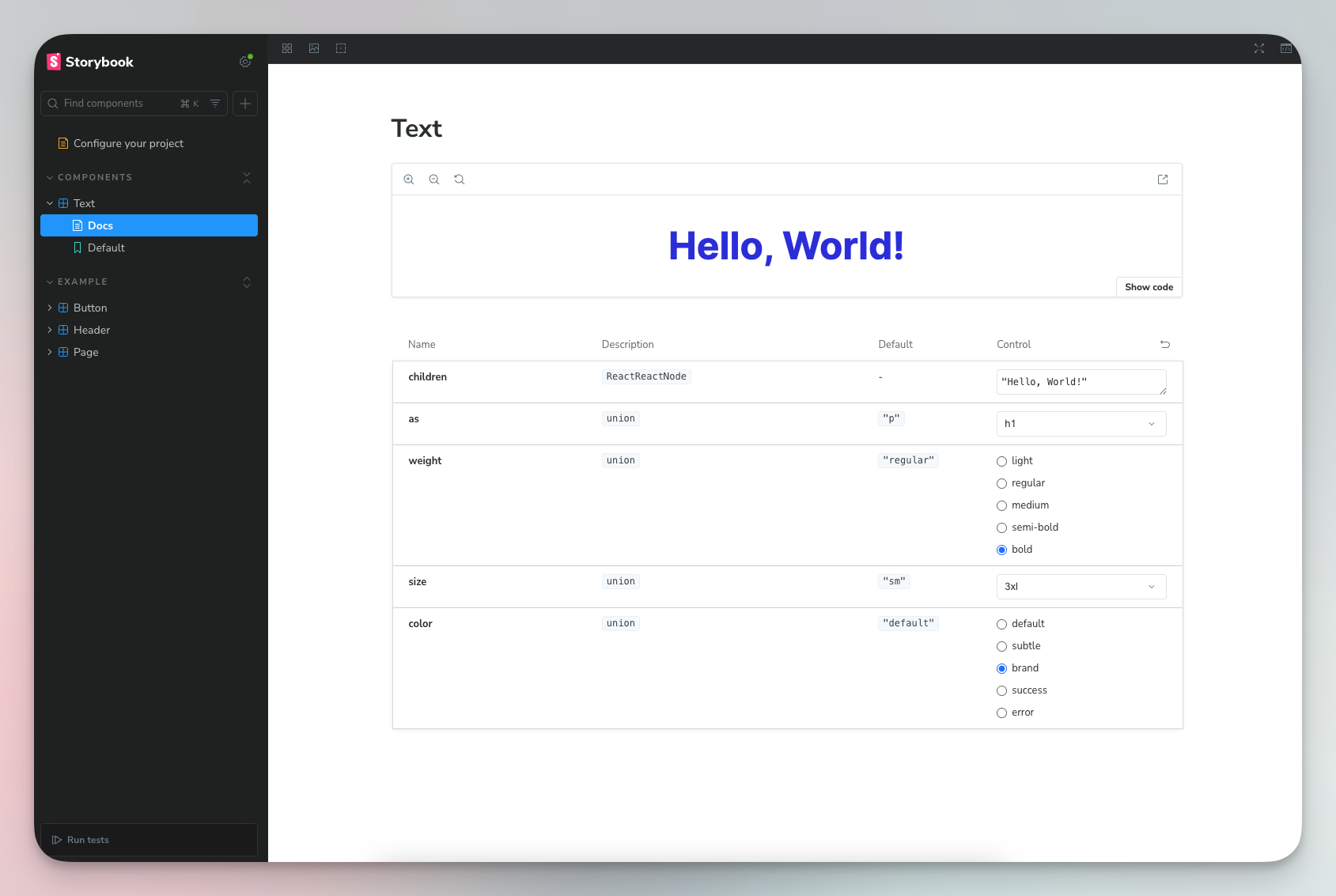
- You should now have a folder in Storybook called ‘Components’, with a component called ‘Default’, and one Default use.

Semantics
In my experience building products, tightly coupling the styling and semantics of HTML text elements is rarely a good idea. Many design systems are set up with the h1 larger than the h2, which is larger than the h3, and so on. But in real-world use cases, we find that a section heading may be smaller than its sub-headings.
The only use cases where size must align with semantic order are those where we need to represent the order visually, e.g., markdown to webpage tools. Else, you might build a rigid system that will eventually be broken with manual overrides.
as/Component
The as prop is a polymorphic prop that lets you choose which HTML element or React component to render. It’s renamed to Component via destructuring. We specify what elements can be rendered to protect the scope of this component.
// src/components/Text/index.tsximport React from "react";type TextElement =| "p"| "span"| "strong"| "em"| "label"| "h1"| "h2"| "h3"| "h4"| "h5"| "h6";interface TextProps {as?: TextElement;children?: React.ReactNode;}const Text = ({ as: Component = "p", children }: TextProps) => {return <Component>{children}</Component>;};export default Text;```tsx// example uses<Text>Regular paragraph</Text> // renders as <p><Text as="h1">Heading</Text> // renders as <h1><Text as="span">Inline text</Text> // renders as <span>
children
The children prop is the content rendered inside the component as seen in the examples above.
Styling
First, you need to reset all default CSS styling. I’ve been using the meyerweb reset by Eric Meyer for years now.
- Simply copy the content of the CSS code block, and paste it into your
App.css. - Clear out all other styles in
App.cssandindex.css. - Import your
App.cssinto.storybook/preview.tsjust like we did withtokens.cssso that Storybook also has access to these resets.
Font family
This project only uses one font family, so we’re going to set that in the CSS file.
- Add the needed font family and weights to the
index.htmlfile. Also create a.storybook/preview-head.htmlfile and paste in the same links. This loads the font for both the app and Storybook.
<link rel="preconnect" href="https://fonts.googleapis.com"><link rel="preconnect" href="https://fonts.gstatic.com" crossorigin><link href="https://fonts.googleapis.com/css2?family=Inter:ital,opsz,wght@0,14..32,100..900;1,14..32,100..900&display=swap" rel="stylesheet">
- In
src/components/Text, create atext.module.cssfile, and import it in thetsxfile.
// src/components/Text/index.tsx...const Text = ({ as: Component = "p", children }: TextProps) => {const classes = [s.text].filter(Boolean).join(" ");return <Component className={classes}>{children}</Component>;};...
- Paste the CSS variables into the style file. Then assign the font family variable to the text component, along with a fallback.
/* src/components/Text/text.module.css */.text {font-family: var(--text-font-family-inter), sans-serif;}

Font weight
- We’re handling font weight using a prop called
weight.
// src/components/Text/index.tsx...type TextWeight = "light" | "regular" | "medium" | "semi-bold" | "bold";export interface TextProps {...weight?: TextWeight;}const Text = ({as: Component = "p",children,weight = "regular",}: TextProps) => {const classes = [s.text, s[`text--weight-${weight}`]].filter(Boolean).join(" ");return <Component className={classes}>{children}</Component>;};...
/* src/components/Text/text.module.css *//* weight modifiers */.text--weight-light {font-weight: var(--text-font-weight-light);}.text--weight-regular {font-weight: var(--text-font-weight-regular);}.text--weight-medium {font-weight: var(--text-font-weight-medium);}.text--weight-semi-bold {font-weight: var(--text-font-weight-semi-bold);}.text--weight-bold {font-weight: var(--text-font-weight-bold);}
- We have five different font weights available. Since the default element is
p, we’ll set the default font weight toregular. We’ll also accept a prop ofweight. - The component receives a weight prop, e.g.,
bold, builds the class name,-text--weight-regular, and styles it in CSS.
Font size and line height
- Our tokens transformation already does the responsiveness work for us. All we need to do is reference the right variables.
- We’re handling font size and line height using a single prop called
size. Each font size and light height variable on the same size, (xs, sm, md, e.t.c), were created to work together. - Then in your component, accept the
sizeprop and use it to create the size class name.
// src/components/Text/index.tsx...type TextSize = "xs" | "sm" | "md" | "lg" | "xl" | "2xl" | "3xl";export interface TextProps {...size?: TextSize;}const Text = ({...size = "sm",}: TextProps) => {const classes = [s.text, s[`text--weight-${weight}`], s[`text--size-${size}`]].filter(Boolean).join(" ");return <Component className={classes}>{children}</Component>;};...
- Define your size modifiers in CSS.
/* src/components/Text/text.module.css *//* size modifiers */.text--size-xs {font-size: var(--text-font-size-xs);line-height: var(--text-line-height-xs);}.text--size-sm {font-size: var(--text-font-size-sm);line-height: var(--text-line-height-sm);}.text--size-md {font-size: var(--text-font-size-md);line-height: var(--text-line-height-md);}.text--size-lg {font-size: var(--text-font-size-lg);line-height: var(--text-line-height-lg);}.text--size-xl {font-size: var(--text-font-size-xl);line-height: var(--text-line-height-xl);}.text--size-2xl {font-size: var(--text-font-size-2xl);line-height: var(--text-line-height-2xl);}.text--size-3xl {font-size: var(--text-font-size-3xl);line-height: var(--text-line-height-3xl);}

Color
We take the same approach with colors.
// src/components/Text/index.tsx...type TextColor = "default" | "subtle" | "brand" | "error" | "success";export interface TextProps {...color?: TextColor;}const Text = ({...color = "default",}: TextProps) => {const classes = [...s[`text--color-${color}`],].filter(Boolean).join(" ");return <Component className={classes}>{children}</Component>;};export default Text;
/* src/components/Text/text.module.css *//* color modifiers*/.text--color-default {color: var(--text-color-default);}.text--color-subtle {color: var(--text-color-subtle);}.text--color-brand {color: var(--text-color-brand);}.text--color-success {color: var(--text-color-success);}.text--color-error {color: var(--text-color-error);}
Additional props
There’s more that goes into creating a typography element. I’ve skipped others on purpose because this article is to provide a foundational guide. You can build on it based on your team’s unique needs.
The Text component accepts any standard HTML attributes through the ...rest spread operator, which is passed directly to the underlying element. This means you can add event handlers like onClick, accessibility attributes like aria-label, or any other valid HTML properties without explicitly defining them in the component's interface.
// src/components/Text/index.tsx...const Text = ({as: Component = "p",children,weight = "regular",size = "sm",color = "default",...rest}: TextProps) => {const classes = [s.text,s[`text--weight-${weight}`],s[`text--size-${size}`],s[`text--color-${color}`],].filter(Boolean).join(" ");return (<Component className={classes} {...rest}>{children}</Component>);};...
One property I often see added by default is margin. Working with default margins is not a great experience, and I find myself overriding them more often than using them. Common reasons why I override default margins:
- I’m using the text in a layout container with defined gaps.
- I need a margin, but it’s different from the default.
- I need the default margin, but I’m mapping over a list and the final element should not have a margin.
Issues like these are based on what you’re building, so if default margins make sense for you, then include them.
Conclusion
You now have a Text component that handles responsiveness via design tokens rather than component-level media queries. This approach scales well because responsiveness is defined once at the token level and inherited everywhere. The same pattern works for spacing, sizing, and other responsive properties across your design system. Start with tokens, reference them in components, and let the system handle the rest.