jennakafor00@gmail.com
Jen.
Why Developers Should Care About Design Tokens
Design tokens are the missing link between design intention and the code you ship.
27, Oct, 2025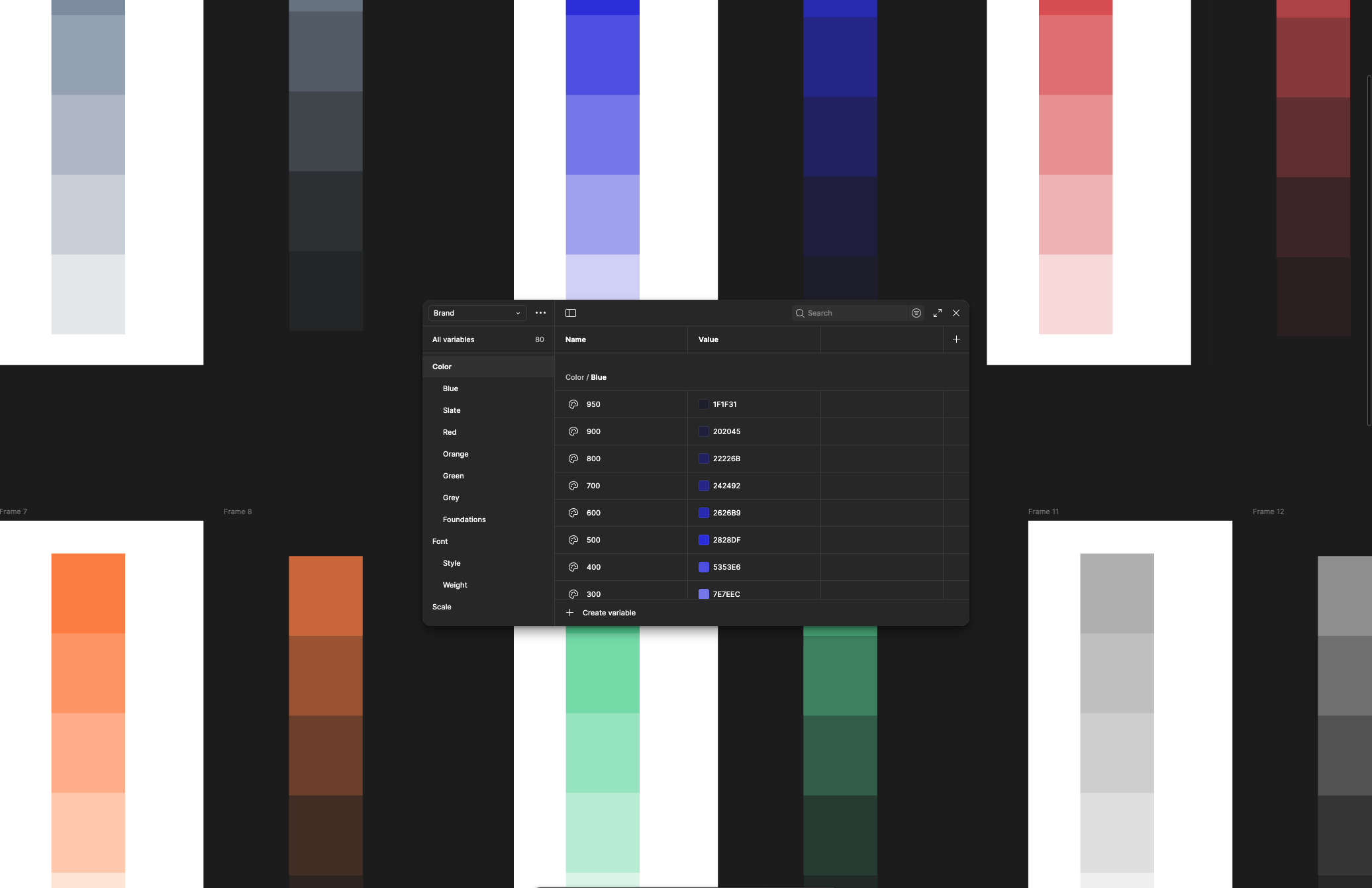
Have you ever wondered how designers make the decisions that shape your product? Design tokens are the low-level decisions that form the building blocks of your designs. At the base level, they include a name and a value.
Jina Anne came up with the concept of ‘Design Tokens’ during her time at Salesforce. The Material Design team thinks of design tokens as "small, reusable design decisions that make up a design system's visual style. Tokens replace static values with self-explanatory names."
Design tokens are used to define and store color, dimensions such as border radius, and border width, typography such as font family, font weight, and letter spacing, opacity, box shadow, and some more.
Why should developers care about design tokens?
To put it simply, they make your work easier, your code cleaner, and your product more consistent. By aligning design and development through a shared language, tokens remove ambiguity and speed up collaboration. Here’s why having access to them matters.
- Tokens act as a single source of truth
When making design or development decisions, both teams reference the same resource. For dev teams, this also cuts across different platforms. Developers building on web, iOS, Android, and so on, are also referencing the exact source of truth.
- Consistency at scale
If you operate in a small team or you’re just building one product, then copying hex codes, border values, and so on as you develop might not be a problem. But think about orgs where multiple people work across various products.
Say you have a customer product, an internal admin product, a B2B partner product, and so on. Multiple design and development decisions are made on these products every day. Without a proper structure, you will start to experience drift in the expectations for different products. You want to be able to go from one to the other, and the interfaces look like the same team designed them.
Shared tokens ensure quality remains consistent as you continue to scale.
- Improved maintainability
Have you ever worked on a project where new interfaces change ever so slightly, and a couple of years in, a new page looks wildly different from an old one? The design team updates the interfaces as they learn about user needs, but the developers lack the resources or simply don’t care enough to revisit and update older interfaces.
When everything is hardcoded, maintenance becomes more expensive. Using design tokens makes it easy to make changes. In some cases, developers don’t even have to do anything. Designers can implement the changes they want to see on the platform by updating the design tokens.
- Performance gains
Using design tokens can also improve performance. When tokens are compiled into CSS variables, they reduce repetitive declarations and cut down your CSS bundle size. This leads to faster load times and smoother rendering. And since tokens encourage cleaner, modular code, your UI becomes easier to optimize across multiple platforms.
Understanding design tokens for developers
First, understand that not every design token is meant for developers. The complete set can be extensive and even overwhelming. As a developer, you only need the tokens that directly influence how you build and style components. Focus on the ones that guide implementation decisions, not design exploration.
We often see design tokens broken down into three levels:
- Option tokens
These are the core style values that come from the brand. For example, every single color in every shade that could ever make it into your final product. Many will never even make it. These are simply there as resources for the designers to pull from. They also include your font(s) in all possible variations, all spacing units, and so on. These are raw ingredients that are unlikely to be helpful to a developer.
//examplesblue500 = #1E62FFyellow500 = #F5A623neutral900 = #0F172Aneutral0 = #FFFFFFradiusMd = 8px
- Alias/Semantic tokens
At this level, we start to give intent to the option tokens. Designers reference them to set the tokens needed to make component decisions. As a developer, you probably don’t need access to these either unless you are working with multiple themes, multiple brands, or you are a core member of the design system teams.
//examplescolor.primary = blue500color.accent = yellow500color.text.default = neutral900color.text.inverse = neutral0radius.control = radiusMd
- Mapped/Component tokens
These are the visual properties of a component’s UI. They are mapped from the aliases and reference the specific components to which they should be applied. As a developer, this is likely what you need from your designer.
//examplesbutton.background = color.primarybutton.text = color.text.inversecard.background = color.text.inversecard.text = color.text.defaultcard.radius = radius.control
How do developers use design tokens?
There are many use cases, but I’ll speak to the three I've seen over and over again.
- Generate global styles
We can export design tokens manually or automatically into JSON (using tools such as Tokens Studio). This JSON is then converted (using a transformation tool such as Style Dictionary) into global styles. These could be CSS variables, SASS maps, JS constants, Swift files, etc.
For example,
color.primary = #24bf52
becomes
:root { --color-primary: #24bf52; }
- Style components directly
You can also use design tokens to style components in your codebase without relying on global styles. This makes your components portable and easier to theme. By importing token values from a JSON file, you ensure every style is consistent with the design system. When a token updates, all components using it automatically reflect the change; no manual refactoring needed.
// tokens.json{"color": { "brand": { "primary": "#0066FF" } },"spacing": { "md": "16px" }}// Button.jsxconst Button = styled.button`background: ${tokens.color.brand.primary};padding: ${tokens.spacing.md};`;
- Dynamic theming
Users can switch themes easily. This is helpful for personalization, providing accessibility modes, multi-brand systems, and so on.
[data-theme="dark"] { --color-background-default: #121212; }
Design tokens strengthen the collaboration between design and development. They make your product more consistent, scalable, and maintainable across teams and platforms. Instead of juggling endless style updates, you simply update a token and watch changes flow across your system.
Whether you’re managing a single product or a whole ecosystem, tokens bring order and flexibility. They turn design systems into living, evolving assets that everyone can rely on.