jennakafor00@gmail.com
Jen.
From Figma to npm Package: Automate Your Design Tokens Pipeline
A step-by-step guide to transforming design tokens into an automated npm package using Figma, Tokens Studio, and Style Dictionary.
05, Nov, 2025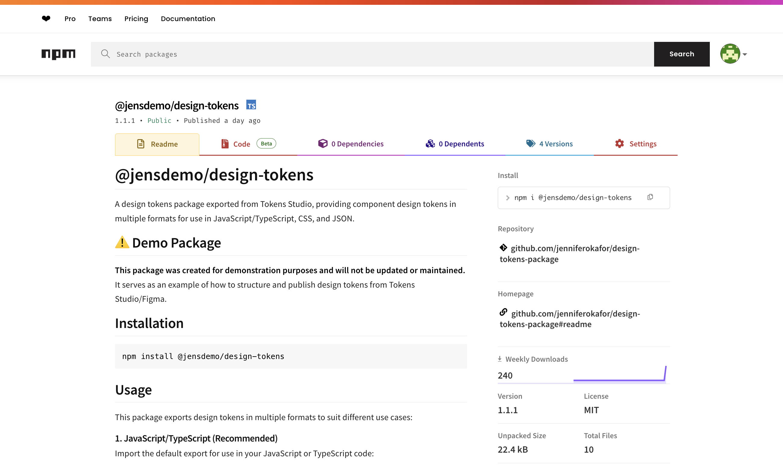
In my previous article, I wrote about why developers should care about design tokens. If you haven’t read it yet, or don’t have a clue what design tokens are, you should take a few minutes to check it out.
Design tokens keep your product looking and feeling the same everywhere. But only if developers can actually use them. So in this article, we’ll take those tokens your design team worked on and turn them into a shareable npm package. That way, every app can pull from one source of truth instead of everyone styling things differently.
For this (not so) simple trick, we’ll need the following tools:
- Figma
- Tokens Studio Plugin
- Node.js and an npm account
- Style Dictionary
- GitHub
- A code editor/IDE
- Some JavaScript knowledge and a few other packages
An important prerequisite: DTCG standards alignment
Before you start this process, your development and design teams should align on using the DTCG (Design Tokens Community Group) standards for setting up your tokens.
Without this alignment, you'll likely run into several issues:
- Naming convention conflicts: Figma Variables and Tokens Studio might structure token names differently than what Style Dictionary expects, causing transformation failures.
- Type mismatches: A token defined as a "color" in your design tool might not map correctly to CSS variables if the type definitions aren't standardized.
- Broken token references: Aliased tokens (tokens that reference other tokens) can fail to resolve properly during the transformation process.
- Manual cleanup overhead: You'll spend countless hours manually fixing JSON files after each sync instead of having an automated pipeline.
The DTCG format provides a common language that ensures your tokens maintain their integrity as they move from design tool to code. Have this conversation with your design team early; ideally before any tokens are created. If your tokens are already set up in a non-standard format, you may need to refactor them before proceeding with this workflow.
Brief overview of how this works
Here’s a quick look at how we go from tokens to an npm package. Your design tokens start in Figma, either as Variables or inside Tokens Studio. From there, you’ll sync them to GitHub, where they’ll live as JSON files. Then we’ll use a few tools to turn those files into code-friendly formats like CSS variables and JSON objects. Finally, we’ll package everything up and publish it to npm so every team can use the same design values everywhere.
That’s it. Design → Sync → Transform → Publish → Use.
How to publish your design tokens
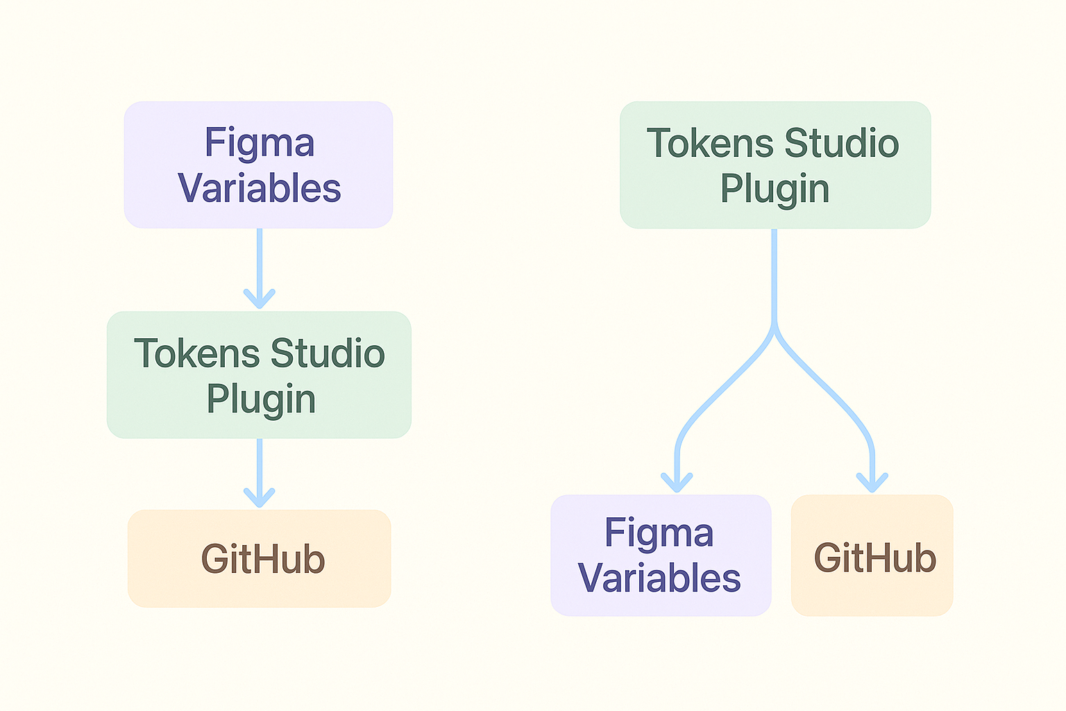
Import your Figma Variables into Tokens Studio
The Tokens Studio plugin is a powerful tool for managing design tokens. For the purpose of achieving our goal, it helps us export the variables defined in Figma as JSON to be stored in a GitHub repository.
If your tokens are in Figma Variables, this guide should help you get them into Tokens Studio. Or you can bypass this process entirely by using the Tokens Studio plugin to set up your tokens. Using this guide, you can export them to Figma as variables to be used in the design process.
So your flow either looks like one of these two.
If you do not have any tokens to set up, you can copy the tokens I will be using for this demo from my samples folder. It’s a small three-level token setup with only the values needed to demonstrate our results at the end. Do the following:
- Create a new Figma file.
- Click on ‘Actions’, switch to the ‘Plugin & Widgets’ tab, search for ‘Tokens Studio for Figma’, and select it.
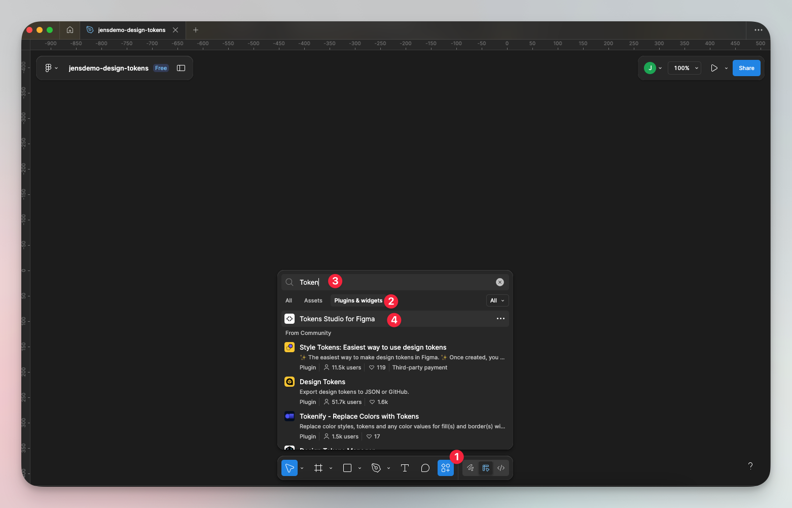
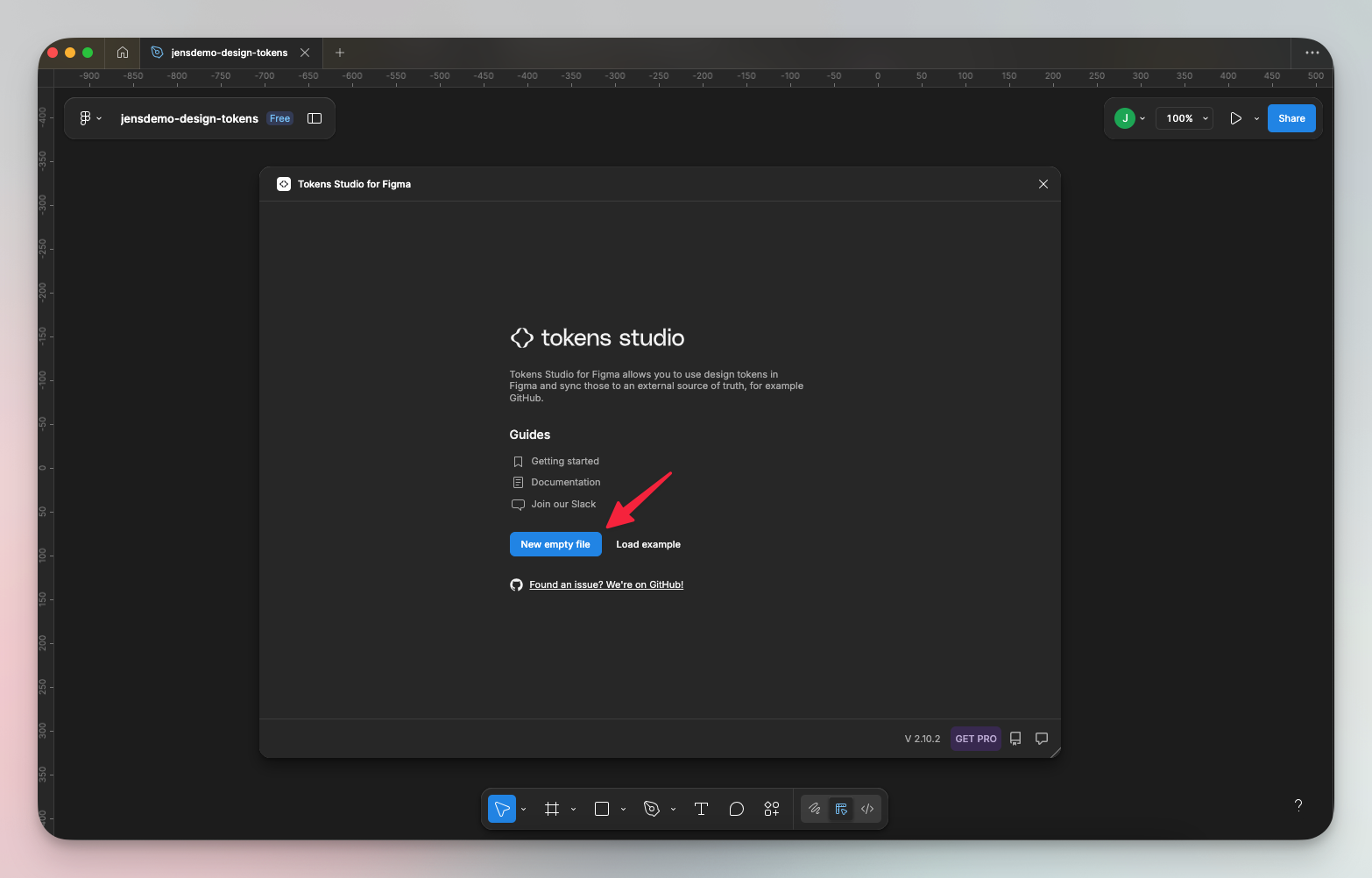
- When the plugin loads, select ‘New empty file’.
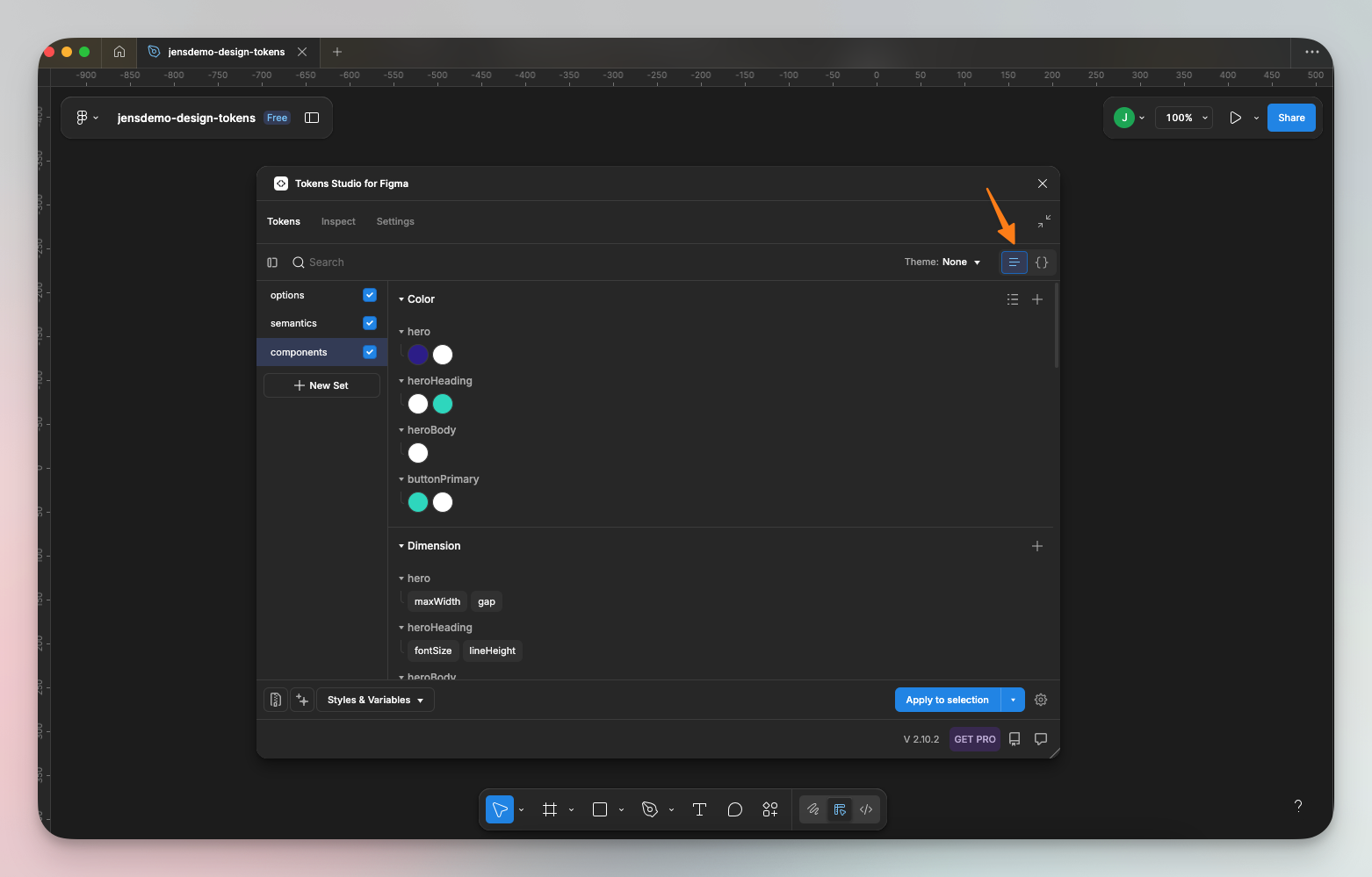
- Rename the default set to ‘options’, then create two others called ‘semantics’, and ‘components.’ All lower case.
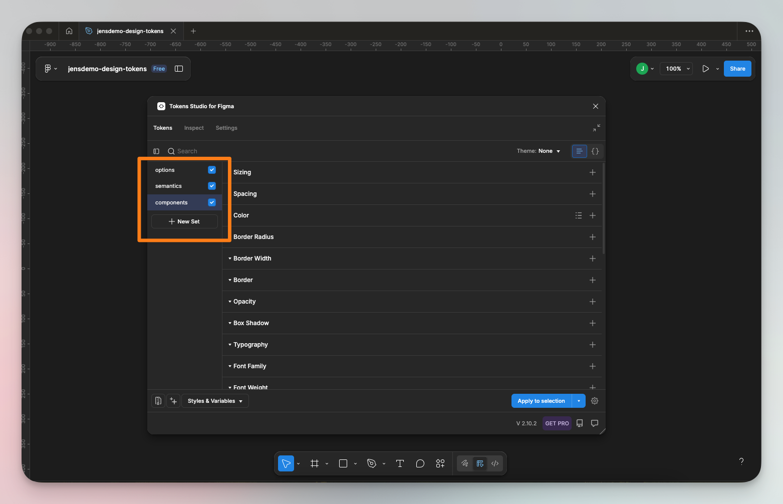
- Copy and paste the JSON objects from the files into the corresponding JSON editor on each set.
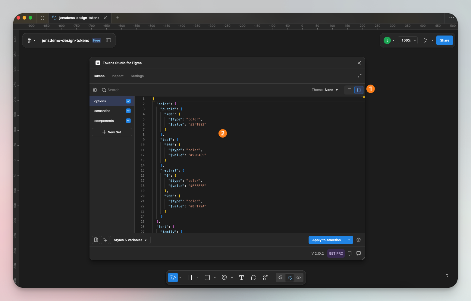
- Make sure you start with ‘options’. Since each set references the previous, you must do this in order. Click save on each then check the list screen to ensure each style saved correctly.
Your tokens are now ready for export!
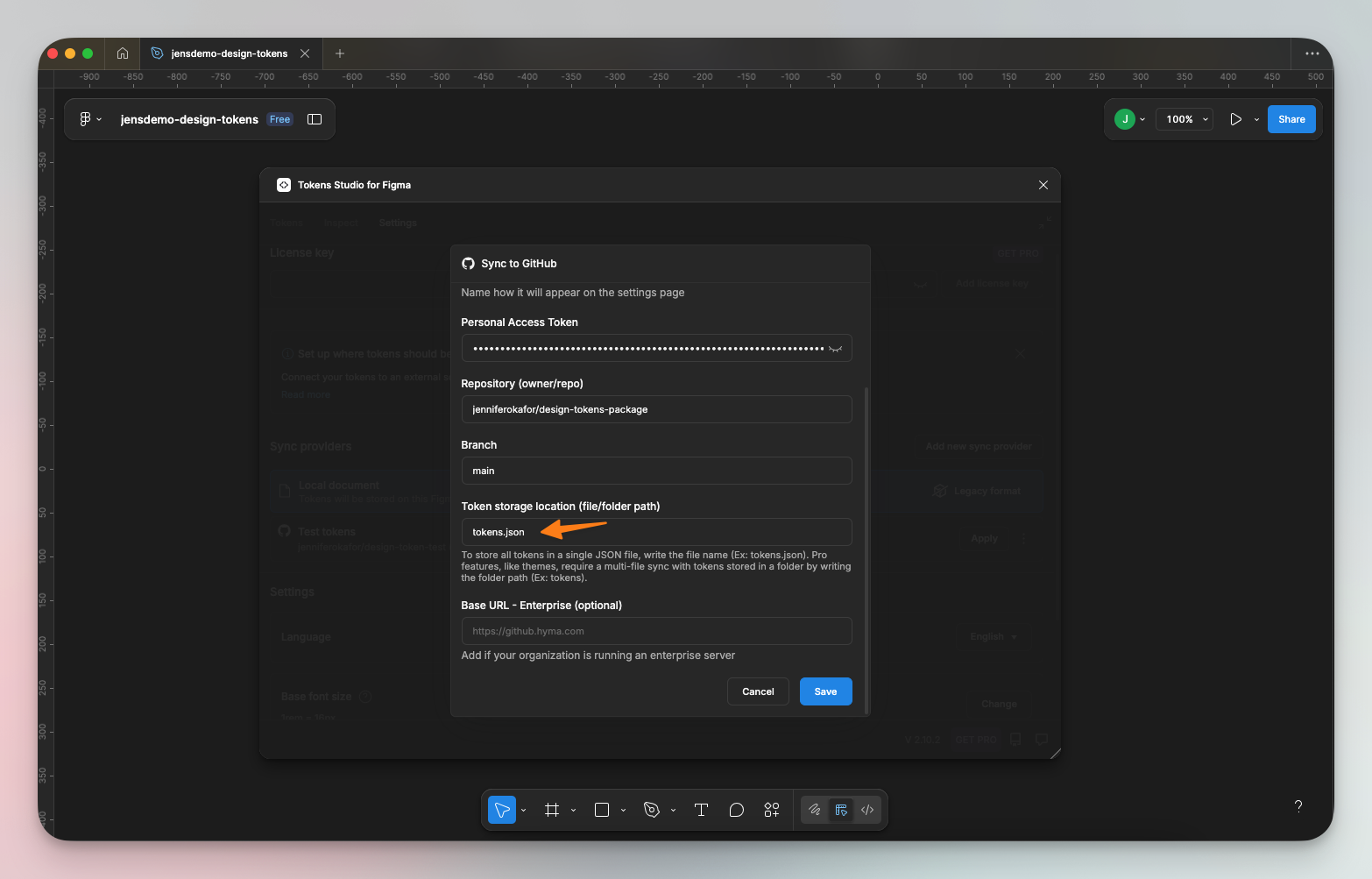
Setup the GitHub <> Tokens Studio sync
Tokens Studio plugin offers a native integration with GitHub to sync your tokens with the repo. You can follow the official Tokens Studio guide here to achieve this connection.
If you’re using the free version of the plugin, you’ll only be able to connect to your main branch. This means that updates from design to GitHub will be pushed directly to the main branch. To switch branches, you must upgrade to the Pro version of the Tokens Studio plugin.
I am exporting all tokens into a single file called tokens.json, and I have appended .json to indicate that I want all tokens stored in a single file. Multiple files are a Pro feature.
Create an npm account and set up your organization
You’ll need an account to publish your package.
- Go to the npm signup page https://www.npmjs.com/signup.
- Fill the signup form and submit.
- Click on the user image, then select ‘Add Organization’.
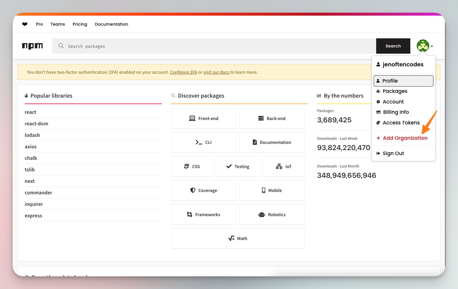
- Enter the organization name of your choice. You can select to create public or private (paid) packages. I’ll go with public.
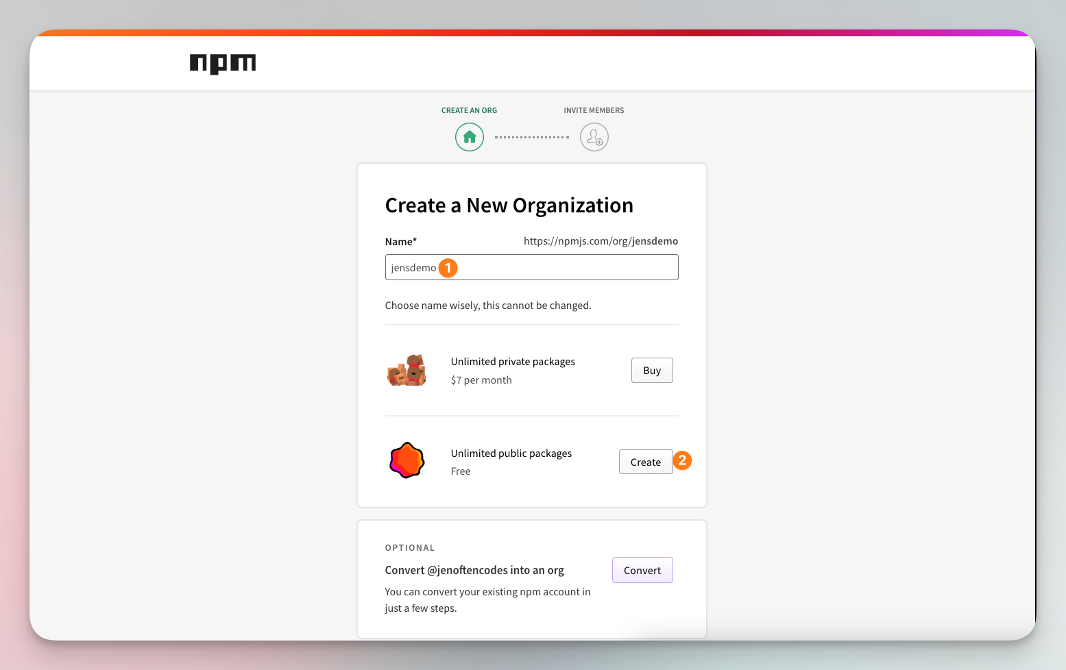
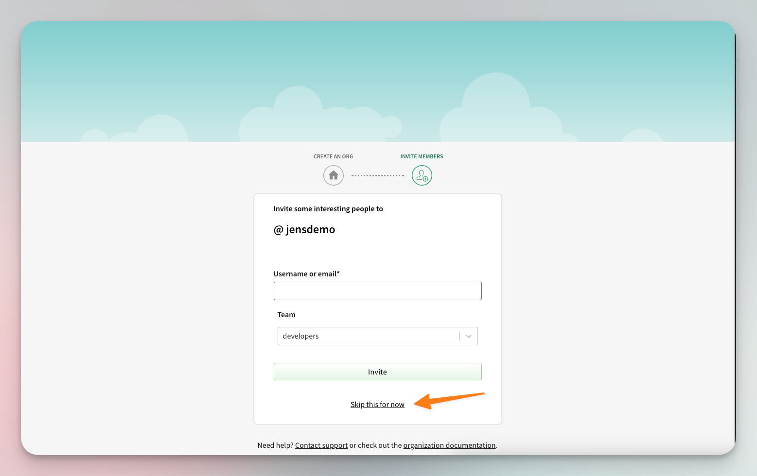
- You might be prompted to add users to the organization. You can skip this step for now.
- We need to set up trusted publishing between GitHub and npm to enable automated deployments. A package needs to exist before we can set up trusted publishing, so we need a placeholder package.
- We’ll create one using setup-npm-trusted-publish by azu.
- Log in to npm through your terminal by running
npm login. This takes you to the browser to complete the login process. Once successful, you should see “Logged in on https://registry.npmjs.org/.” in your terminal. - In a terminal window, run
npm install -g setup-npm-trusted-publish - Run
setup-npm-trusted-publish <package-name>. For me, that looks like:
setup-npm-trusted-publish @jensdemo/design-tokens
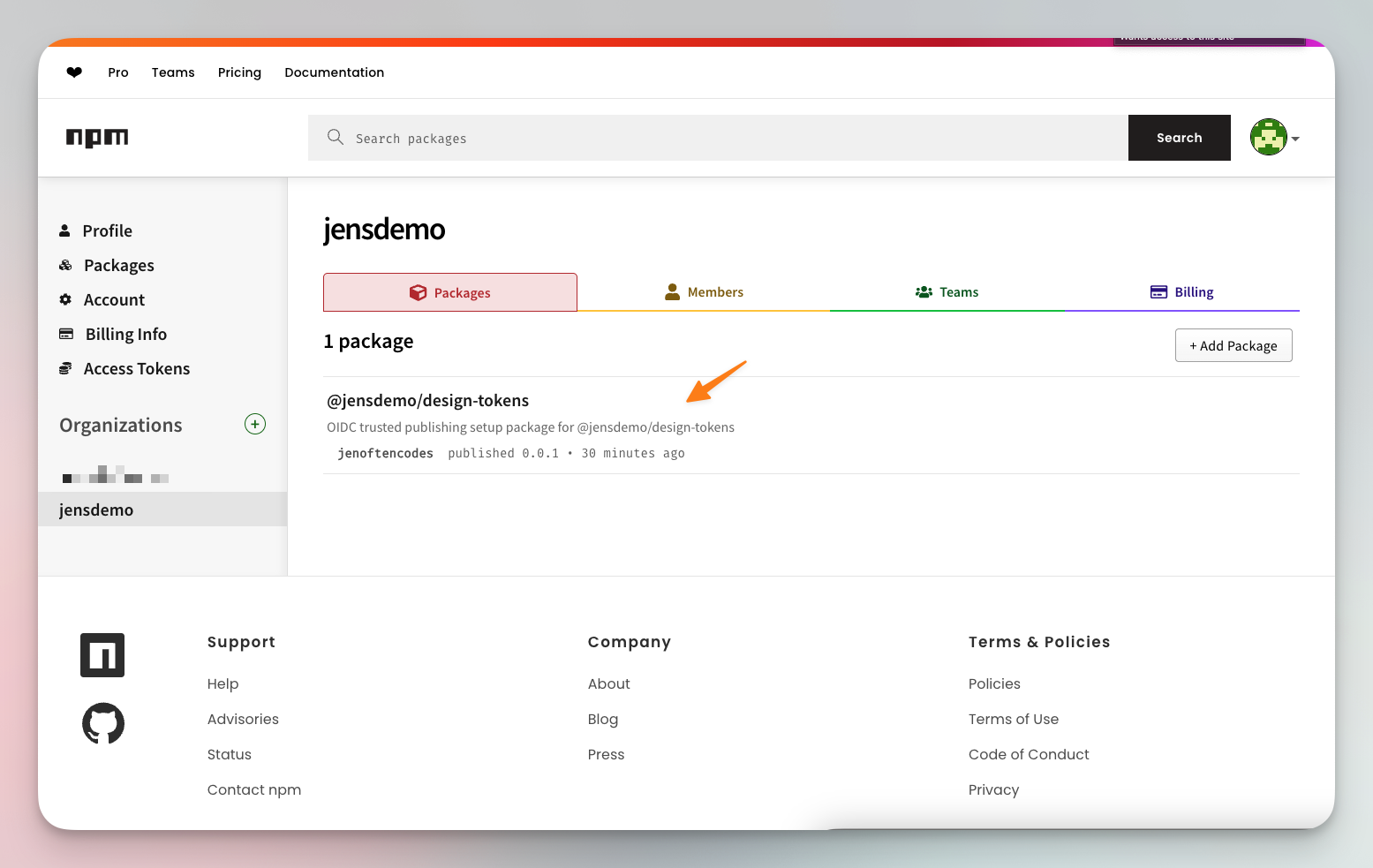
- You should see a success message. Refresh your organization’s page on npm to see the new package.
- To continue the trusted publishing set up, click on the package and navigate to the ‘Settings’ tab. Then select ‘GitHub Actions’ as your publisher.
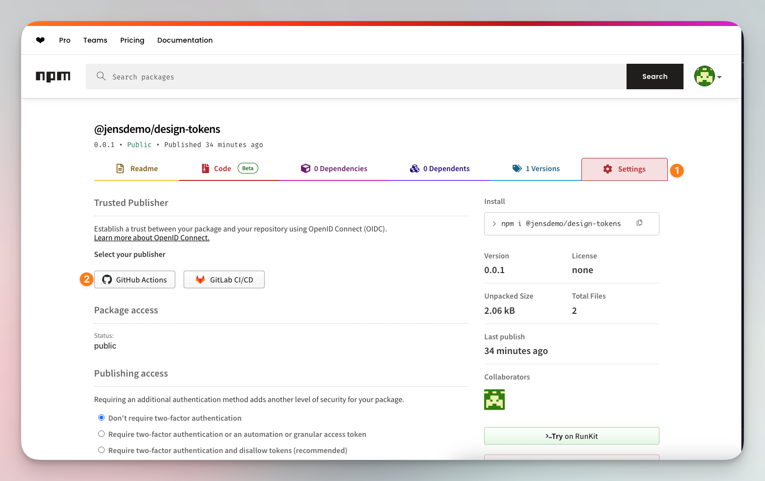
- Under ‘Organization or user’, enter your GitHub username or your organization’s name. Also enter your repository name. For ‘Workflow file name’, enter
release.yml.
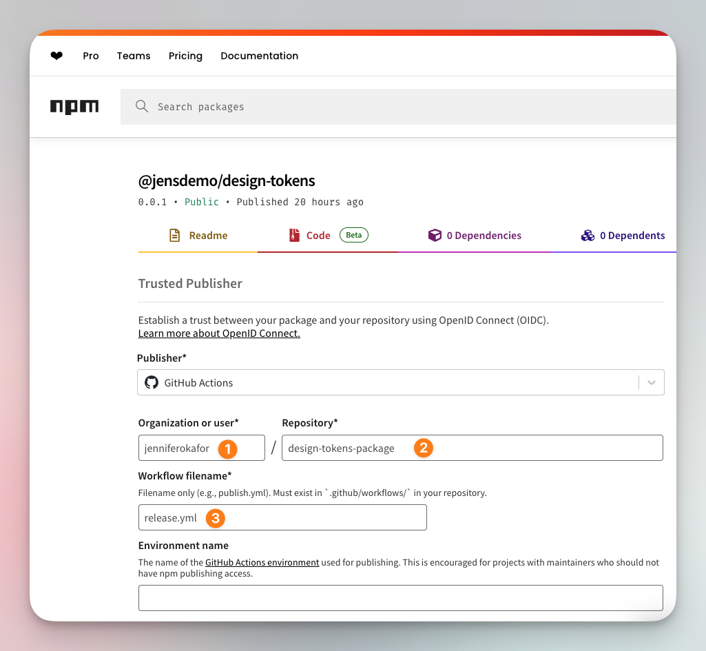
- Click ‘Setup connection’.
Set up your local repository
If you followed the ‘Setup the GitHub <> Tokens Studio sync’ guide, then you should have a repository on GitHub with one or more JSON files containing your design tokens. The next step is to set up locally.
- First, clone the repository that holds your tokens. You can follow the GitHub guide on how to do this.
- Create a
package.jsonfile by runningnpm init. - In the utility workthrough, enter your package name exactly as it appears on npm e.g.
@jensdemo/design-tokens - Enter 0.0.1 as the version.
- You can accept the defaults for everything else, or update them if needed.
- Create a .gitignore file, and paste in the following:
node_modules
Transform your tokens into CSS variables and JSON objects
Back to the fun part! We’re going to take the design tokens that currently live in our repository and convert them into CSS variables and JSON objects.
First, we’re going to install Style Dictionary, Tokens Studio’s SD Transforms, and Typescript. These packages will handle the heavy lifting behind the scenes. The Style Dictionary is what actually builds and outputs our tokens into formats such as CSS or JSON. The Tokens Studio SD Transforms plugin helps it understand the structure that comes from Figma, so references resolve correctly. And TypeScript ensures that everything we generate and export has proper types.
- Open your terminal and ensure you’re in the repo’s directory. Then run:
npm i -D style-dictionary @tokens-studio/sd-transforms typescript
- Now, we’re going to manually update the
package.jsonfile with some needed configurations.- type: set it to "module" so Node and modern bundlers treat the files as ES modules.
- main: this points to the CommonJS build so older projects can still import it easily.
- module: this gives modern tools an ES module entry for faster, cleaner imports.
- types : this tells TypeScript users where to find the type definitions.
- exports: add it so users can import CSS, JSON, or raw tokens from specific paths.
- files: limits what gets published so the npm package stays clean and lightweight.
- tokens:build: this script builds the tokens into ready-to-use files.
- tokens:watch: this script rebuilds automatically whenever token files change.
- prepublishOnly: it ensures the tokens build before every publish to npm.
- keywords – these make the package easier to find on npm. This helps if you’re publishing a public package that you want others developers to adopt.
You can see my package.json below.
{"name": "@jensdemo/design-tokens","version": "0.0.1","description": "Design tokens from our design system.","type": "module","main": "dist/index.cjs","module": "dist/index.js","types": "dist/index.d.ts","exports": {".": {"types": "./dist/index.d.ts","import": "./dist/index.js","require": "./dist/index.cjs"},"./css/variables.css": "./dist/css/variables.css","./json/components.json": "./dist/json/components.json","./raw/tokens.json": "./tokens.json"},"files": ["dist","tokens.json","README.md","LICENSE"],"scripts": {"tokens:build": "style-dictionary build --config sd.config.js --verbose","tokens:watch": "style-dictionary build --config sd.config.js --watch --clean","prepublishOnly": "npm run tokens:build"},"keywords": ["design-tokens","style-dictionary","tokens-studio"],"author": "jenoftencodes","license": "MIT","bugs": {"url": "https://github.com/jenniferokafor/design-tokens-package/issues"},"homepage": "https://github.com/jenniferokafor/design-tokens-package#readme","devDependencies": {"@tokens-studio/sd-transforms": "^2.0.1","style-dictionary": "^5.1.1","typescript": "^5.9.3"}}
- In the root folder, create an
sd.config.jsfile. This is where we will transform our JSON objects into usable style variables. If you’re using the same token structure as I am, then the transforms below should work for you. It’s possible that there’s a cleaner, more native way to do this, but the approach below has worked for me so far.
/** sd.config.js */import fs from "fs";import StyleDictionary from "style-dictionary";import * as sdTransforms from "@tokens-studio/sd-transforms";sdTransforms.register(StyleDictionary);const raw = JSON.parse(fs.readFileSync("tokens.json", "utf8"));/*** Deep merge function to combine token sets while preserving nested structures*/const deepMerge = (target, source) => {const output = { ...target };if (source && typeof source === "object" && !Array.isArray(source)) {Object.keys(source).forEach((key) => {if (source[key] &&typeof source[key] === "object" &&!Array.isArray(source[key]) &&!source[key].$type &&!source[key].$value) {output[key] = deepMerge(target[key] || {}, source[key]);} else {output[key] = source[key];}});}return output;};// Deep merge options and semantics as base (for reference resolution)// This preserves nested structures so options.color.teal.500 and semantics.color.primary// can coexist at color.teal.500 and color.primaryconst base = deepMerge(raw.options ?? {}, raw.semantics ?? {});const tokens = {...base,components: raw.components ?? {},$metadata: raw.$metadata ?? {},};// Filter to only include tokens inside the components setconst onlyComponents = (token) => token.path[0] === "components";/*** Custom name transform that removes the "components" prefix* and converts to kebab-case.*/StyleDictionary.registerTransform({name: "name/kebab-no-components",type: "name",transform: (token) => {const path =token.path[0] === "components" ? token.path.slice(1) : token.path;return path.join("-").replace(/([a-z0-9])([A-Z])/g, "$1-$2").replace(/[\s_]+/g, "-").toLowerCase();},});/*** Helper function to extract nested component tokens and remove the "components" prefix.* Uses the nested dictionary.tokens structure and extracts just the resolved values.*/const extractComponentsFromTokens = (tokensObj) => {if (!tokensObj || !tokensObj.components) {return {};}const extractValues = (obj) => {if (!obj || typeof obj !== "object" || Array.isArray(obj)) {return obj;}if ("$value" in obj && Object.keys(obj).length > 1) {return obj.$value;}const result = {};for (const [key, value] of Object.entries(obj)) {result[key] = extractValues(value);}return result;};return extractValues(tokensObj.components);};/*** Format for ESM JavaScript export*/StyleDictionary.registerFormat({name: "javascript/esm-components",format: ({ dictionary }) => {const tokens = extractComponentsFromTokens(dictionary.tokens);return `export default ${JSON.stringify(tokens, null, 2)};`;},});/*** Format for CJS JavaScript export*/StyleDictionary.registerFormat({name: "javascript/cjs-components",format: ({ dictionary }) => {const tokens = extractComponentsFromTokens(dictionary.tokens);return `module.exports = ${JSON.stringify(tokens, null, 2)};`;},});/*** Format for nested JSON export*/StyleDictionary.registerFormat({name: "json/nested-components",format: ({ dictionary }) => {const tokens = extractComponentsFromTokens(dictionary.tokens);return JSON.stringify(tokens, null, 2) + "";},});export default {tokens,preprocessors: ["tokens-studio"],clean: true,platforms: {css: {transformGroup: "tokens-studio",transforms: ["name/kebab-no-components"],buildPath: "dist/css/",files: [{destination: "variables.css",format: "css/variables",options: { selector: ":root" },filter: onlyComponents,},],},json: {transformGroup: "tokens-studio",buildPath: "dist/json/",files: [{destination: "components.json",format: "json/nested-components",filter: onlyComponents,},],},js: {transformGroup: "tokens-studio",buildPath: "dist/",files: [{destination: "index.js",format: "javascript/esm-components",filter: onlyComponents,},{destination: "index.cjs",format: "javascript/cjs-components",filter: onlyComponents,},],},},};
- If you’re using a different token structure or need more custom transforms, read the documentation for Style Dictionary and Style Dictionary Transforms for Tokens Studio to set up your own transformation.
- If your setup works, you should be able to run
npm run tokens:buildand see theCSS,JSON,index.cjs, andindex.jsoutputs indist/.
/** dist/css/variables.css *//*** Do not edit directly, this file was auto-generated.*/:root {--hero-background: #2f1893;--hero-text: #ffffff;--hero-max-width: 665px;--hero-gap: 20px;--hero-heading-color: #ffffff;--hero-heading-accent-color: #25dac5;--hero-heading-font-family: 'DM Sans', system-ui, -apple-system, 'Segoe UI', Roboto, Helvetica, Arial, sans-serif;--hero-heading-font-size: 52px;--hero-heading-font-weight: 700;--hero-heading-line-height: 1.2px;--hero-body-color: #ffffff;--hero-body-font-family: 'DM Sans', system-ui, -apple-system, 'Segoe UI', Roboto, Helvetica, Arial, sans-serif;--hero-body-font-size: 18px;--hero-body-font-weight: 400;--hero-body-line-height: 1.2px;--button-primary-background: #25dac5;--button-primary-text: #ffffff;--button-primary-radius: 30px;--button-primary-padding-x: 46px;--button-primary-padding-y: 22px;--button-primary-font-family: 'DM Sans', system-ui, -apple-system, 'Segoe UI', Roboto, Helvetica, Arial, sans-serif;--button-primary-font-size: 16px;--button-primary-font-weight: 500;--button-primary-line-height: 1px;}
Support TypeScript and autocomplete
Now that your tokens build correctly, let’s make them TypeScript-friendly. This step adds type definitions so you get autocomplete and type safety when using the tokens in your code. It’s not required, but it makes the developer experience much smoother.
/** dist/json/components.d.ts *//*** Type definitions for JSON component tokens export** @example* ```ts* import components from '@jensdemo/design-tokens/json/components.json';** const heroBg = components.hero.background;* ```*/export interface ComponentTokens {[key: string]: string;}export interface Components {[componentName: string]: ComponentTokens;}declare const components: Components;export default components;
// dist/index.d.ts/*** Design tokens exported from Tokens Studio** Each component token is an object with string values representing* design properties like colors, sizes, typography, etc.*/export interface ComponentTokens {[key: string]: string;}/*** Design tokens organized by component** Generated from Tokens Studio/Figma tokens** @example* ```ts* import tokens from '@jensdemo/design-tokens';** const heroBg = tokens.hero.background; // "#2f1893"* const buttonColor = tokens.buttonPrimary.background; // "#25dac5"* ```*/declare const designTokens: {[componentName: string]: ComponentTokens;};export default designTokens;
Publish package updates
After transforming our tokens into design assets, we need to publish the updates to the package.
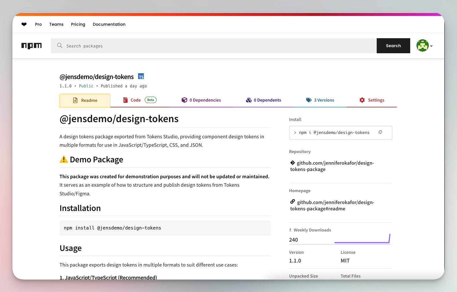
- First, update your README to provide users with proper documentation on what your design tokens include, an installation guide, how-to guides, and examples.
- Next, install
semantic-release. We’ll use this to automate the release process triggered by pushes from Figma and your local environment. Read more in the docs. To install, run:
npm i semantic-release
- Next, create your
release.ymlfile and paste this config:
# .github/workflows/release.ymlname: Releaseon:push:branches:- mainworkflow_dispatch:permissions:id-token: writecontents: writeissues: writepull-requests: writejobs:release:runs-on: ubuntu-lateststeps:- name: Checkout repositoryuses: actions/checkout@v4with:fetch-depth: 0- name: Setup Node.jsuses: actions/setup-node@v4with:node-version: "lts/*"registry-url: "https://registry.npmjs.org"scope: "@jensdemo"- name: Install dependenciesrun: npm ci- name: Build packagerun: npm run tokens:build- name: Releaseenv:GITHUB_TOKEN: ${{ secrets.GITHUB_TOKEN }}run: npx semantic-release
-
Change the scope to your organization's name.
-
Commit your changes with a message starting with “feat:” or “fix:”. Because we are using
semantic-releasefor automated release and versioning, the commit message structure matters. All commits that need to trigger a release must be prefixed with "feat:", "fix:", or "BREAKING CHANGE:". If semantic-release doesn't find any conventional commits, the updates to tokens will not reflect in the package. -
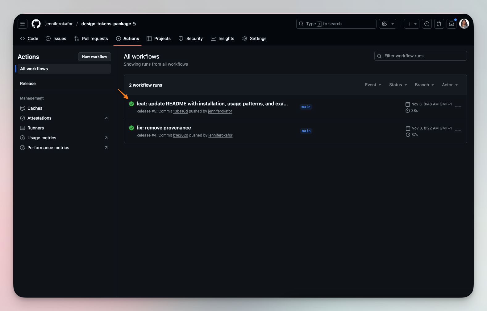
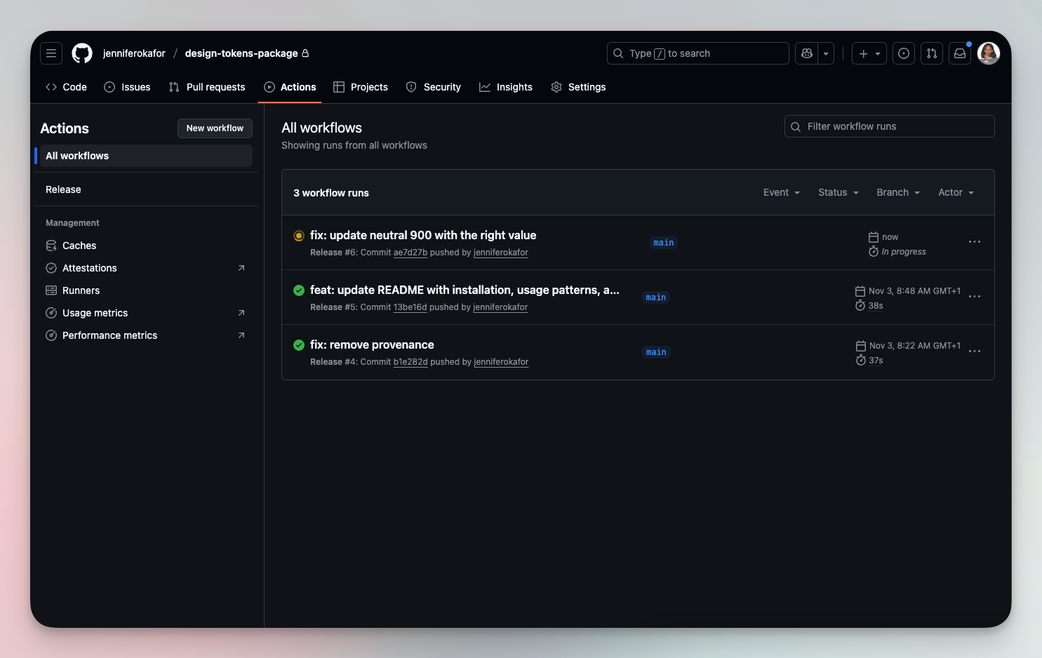
Push your changes, and you should see a running action on GitHub. When successful, the status icon should display a green color.
- Your transformed design tokens should be live and ready for use!
Updating the package using the Tokens Studio Plugin
- To update the package from Figma, simply make the needed changes to the tokens. You can either update your Figma Variables and import the changes into Tokens Studio, or update Tokens Studio directly and export the changes to your variables.
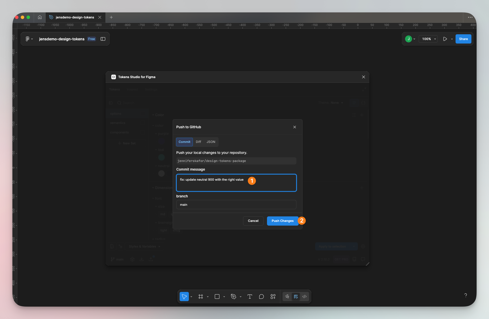
- Once the tokens in Tokens Studio change, the ‘Push’ icon becomes active and shows an indicator.
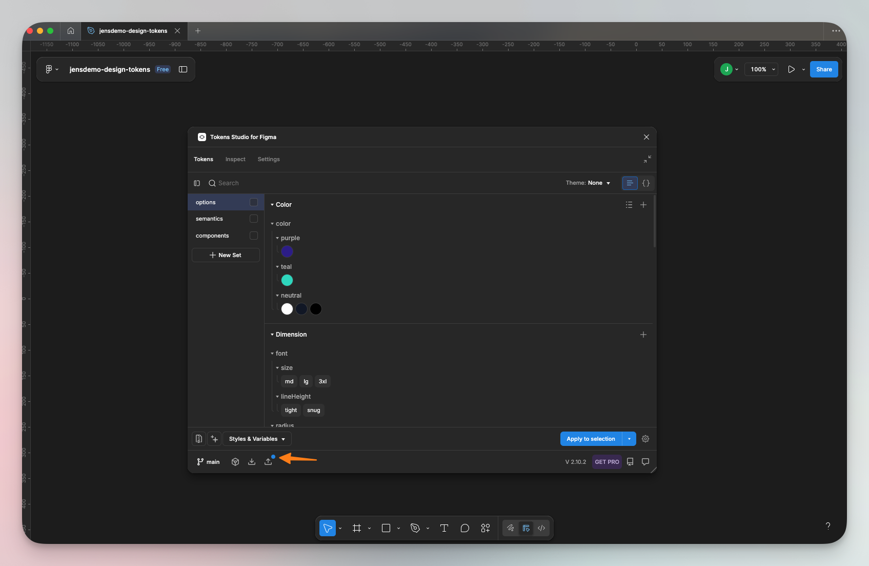
- Click the icon, enter a commit message prefixed with "feat:", "fix:", or "BREAKING CHANGE:", if you want to trigger a release, and click ‘Push Changes’.
- This should immediately trigger a release action on GitHub. Once successful, the changes will be live in your package.
Conclusion
There you have it! A complete, automated workflow that takes your design tokens from living in a neglected design file to a shared source of truth that everyone can work with. Of course, there’s a lot more customization you can do to create a workflow that fits your team’s unique needs. But I hope this serves as a great starting point.
Check out the repo used for demonstration in this article, as well as the published package on npm. Build something fun!